CBA Logo
The following is a logo redesign competition I participated in for the College of Business Administration at the University of Wisconsin La Crosse. I was the runner up. Read article here
- Date: November 2022
- Client: UWL CBA
- Role: Logo Design Runner Up
- www.uwlax.edu/cba/
Client Needs
-
A Fresh Look
Update the logo for the College of Business Administration. The previous was created in the 70s, and doesn't well represent the current CBA's identity.
-
CBA's Mission
Consider the CBA's Mission Statement: "Delivering academic excellence, career success, and community engagement through sharing new knowledge and creating enriching, interactive experiences".
-
Work With UWL Brand
The logo needs to fit within the greater university's brand, yet be distinct enough to give CBA its own identity.
-
Wittich Hall
Consider the newly renovated Wittich Hall which is the home of the CBA on campus.
How it Started
How it's Going
-
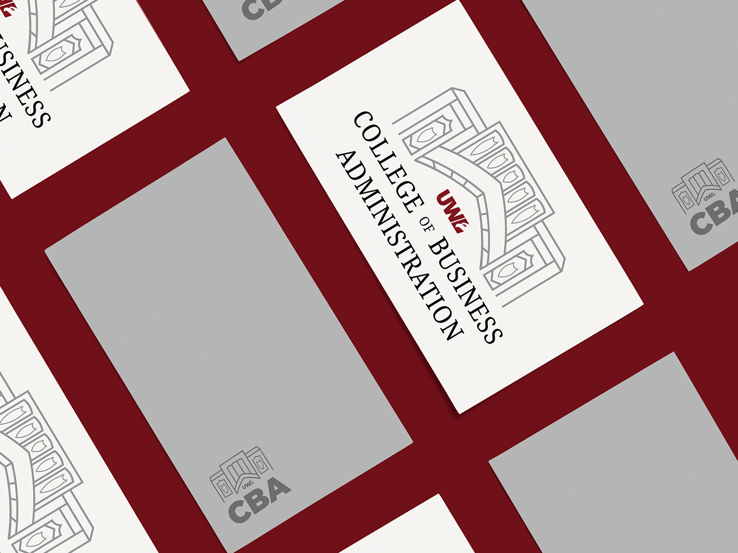
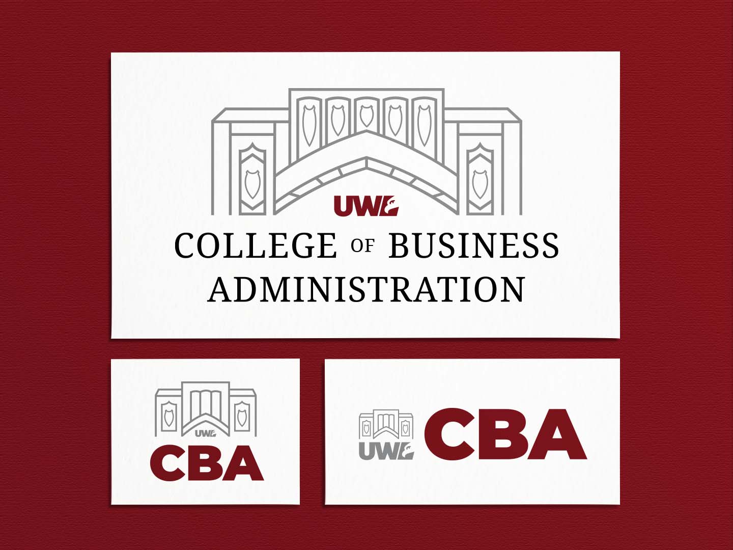
Logomark
The logomark is a simplified depiction of the entrance of Wittich Hall. Visit the CBA's website to see a short video of the building.
-
Why?
I went with Wittich Hall as Taggert Brooks, Dean of the CBA, expressed the pride of the building as the CBA's home. He highlighted the CBA's goal to deepen its sense of community for students; so I figured what better way to evoke a sense of community than to include the 'home' of that community in my design?
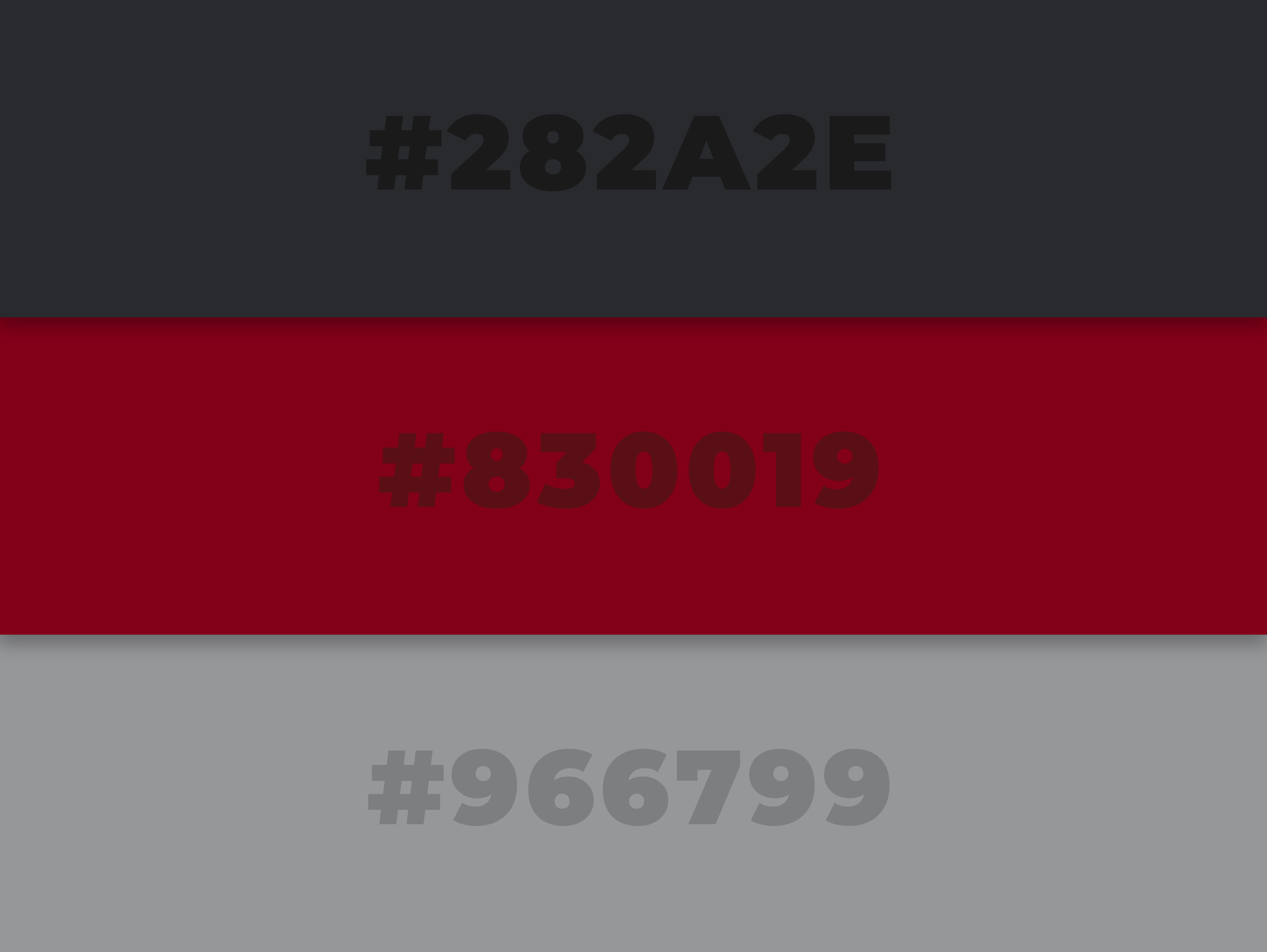
Colors
-
Why?
I pulled these colors straight from UWL's brand. This allowed my design to satisfy the need of the CBA logo to fit within the greater university's brand.
Typography
-
Why?
Noto Serif: Serif fonts evoke feelings of elegance, professionalism, and tradition -- words also commonly associated with academia. Furthermore, Noto Serif is one of the fonts included in the UWL brand standard document.
Montserrat: This heavy font works perfect for the acronym 'CBA' especially for readability at small scales. It is also the same font as UWL's logo.